Brand Guidelines
Logo, type and colour — the working rules for building informedkinetics.com and everything around it.
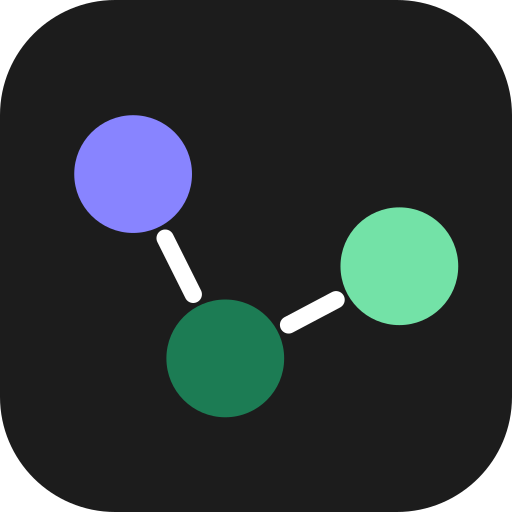
Logo
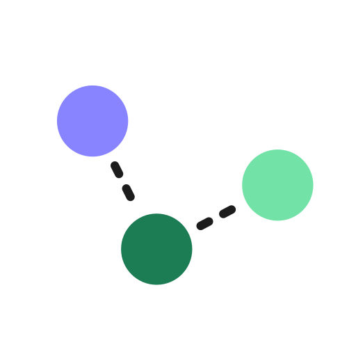
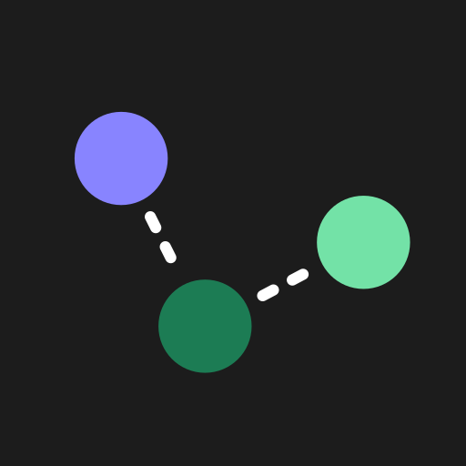
The identity is built from one element: the Scatter mark — three equal particles tracing a trajectory through space, joined by dashed connectors. It reads as data in motion: dose, exposure, effect. Pair it with the Mozilla Text wordmark, or let it stand alone.
The mark · Scatter
Particle order is fixed and never recoloured: lavender (start) → deep green (mid) → mint (lead). Dashes are white on dark surfaces, ink on light. All three particles are the same diameter.
Primary lockups · Mozilla Text 600
Which logo, where
| Variant | Use it for | Avoid |
|---|---|---|
| Stacked lockup | Business cards, report & deck title pages, posters — anywhere with vertical room and a single focal logo. | Tight horizontal bars, favicons. |
| One-line lockup | Website nav bar, email banners, slide footers, document headers, letterhead. | Square crops; widths under ~120px. |
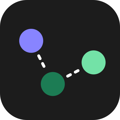
| Rounded-square icon | App icon, favicon, square social avatars, loading states. | As a substitute for the full lockup in primary positions. |
| Circular avatar | Round profile photos — LinkedIn, X, author bylines. | Print or anywhere a square is expected. |
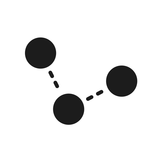
| Bare mark | Email signatures, large decorative crops, watermarks, data figures. | First-impression contexts where the name isn't shown elsewhere. |
Clear space & minimum size
Clear space
Keep a margin equal to x — the diameter of one particle (≈20% of the mark's width) — on every side of the logo, free of text, images and edges. When in doubt, give it more.
Minimum size
Icon / bare mark: 24px on screen, 8mm in print. One-line lockup: 120px wide. Stacked lockup: 96px wide. Below these the dashes break up — for favicon sizes (16px) use the dedicated simplified build (see Logo assets, below).
Do & don't
Use approved colours and full contrast against the surface.
Place on busy gradients or low-contrast backgrounds.
Stretch, squash or rotate the mark.
Recolour or reorder the three particles.
Logo on photography
Over imagery, contrast and legibility win. In order of preference: drop a white-out lockup over a dark, calm area; add a scrim to guarantee it; or place the full-colour logo inside a solid holding panel. Never sit the full-colour mark straight on a busy photo.
White-out lockup over a dark, uncluttered region of the image.
Add a bottom-up scrim (≈72% ink) when the photo is busy or mid-tone.
Solid ink holding panel — the fallback that always works.
Full-colour logo straight on a busy, low-contrast photo.
Use ik-logo-line-mono-white.svg on dark imagery and ik-logo-line-mono-ink.svg on light imagery (both below). Keep the full clear-space margin around the logo and any scrim edge.
Logo assets & downloads
Production-ready SVGs. The mark and icons are pure vector — no font required; the wordmark lockups carry live text, so outline the type in your design tool before print. Click any tile to open or save.


Favicon plan: the dashed connectors blur below ~24px, so ik-favicon.svg is a simplified build — solid connectors, larger particles — that holds at 16px. Export it to 16/32/48px PNG (+ a multi-size .ico), and a 180px apple-touch-icon from ik-app-icon-ink.svg. A paper app icon (ik-app-icon-paper.svg) is included for light contexts.
Colour
Ink and paper carry the work; the trajectory colours sign it. Backgrounds, surfaces and the bulk of text stay neutral. Lavender, green and mint appear in small, deliberate doses — a single accent per view, never all three competing.
Core palette
Print — CMYK & Pantone
Hex is the source of truth on screen. These CMYK builds and nearest Pantone matches are indicative — always pull a proof on the final stock before sign-off. Ink prints as a rich black; paper is the unprinted stock.
| Colour | HEX | CMYK | Pantone (nearest) |
|---|---|---|---|
| Ink | #1C1C1C | 0 / 0 / 0 / 100 · rich 60/50/50/100 | Black 6 C |
| Paper | #FFFFFF | 0 / 0 / 0 / 0 | — (stock white) |
| Lavender | #8884FF | 47 / 48 / 0 / 0 | 2715 C |
| Deep green | #1C7C54 | 82 / 28 / 70 / 13 | 7726 C |
| Mint | #73E2A7 | 45 / 0 / 43 / 0 | 353 C |
| Amber | #E0A24A | 10 / 37 / 78 / 0 | 143 C |
| Slate | #3D5A9E | 78 / 56 / 10 / 1 | 7686 C |
| Danger | #D6534F | 11 / 78 / 65 / 1 | 7625 C |
Text colour — dark (default) & light
On ink (the default surface), accents and links use mint — brightest against the dark. On paper, accent text switches to the deep lavender #5B4FD1 (bright #8884FF is reserved for fills, large display and ink), and green carries inline links.
Default surface & when to go light
The site, app and documents are dark by default — ink surface, paper text. This is the baseline for all body content, navigation, forms, tables and data.
Switch to paper for long-form reading, print, regulatory documents, or a user-selected light theme — this document's toggle, top-right, flips between the two.
Accessibility — contrast (WCAG 2.1)
Every pairing below is measured. Body text must clear 4.5:1 (AA); large text (≥24px, or ≥19px bold) and UI/graphic elements need 3:1. Ratios are against the named surface.
| Foreground · surface | Ratio | Body | Large / UI | Use for |
|---|---|---|---|---|
| Ink · paper | 17.0 : 1 | AAA | AAA | Body & headings on paper. |
| Muted · paper | 7.6 : 1 | AAA | AAA | Secondary / body-muted text. |
| Faint · paper | 2.9 : 1 | FAIL | FAIL | Decorative meta only — never essential text. Use muted if it must read. |
| Deep lavender · paper | 6.0 : 1 | AA | AA | Eyebrows, accent text, focus ring. |
| Bright lavender · paper | 3.1 : 1 | FAIL | AA | Fills, ≥24px display, icons — not body text. |
| Green · paper | 5.2 : 1 | AA | AA | Inline links, positive values. |
| Mint · paper | 1.6 : 1 | FAIL | FAIL | Never text on paper — fills only (with ink label). |
| Ink · mint (button) | 10.7 : 1 | AAA | AAA | Primary CTA label. |
| Mint · ink | 10.7 : 1 | AAA | AAA | Accent text & links on ink. |
| Muted (dark) · ink | 8.0 : 1 | AAA | AAA | Secondary text on ink. |
| Green · ink | 3.3 : 1 | FAIL | AA | Large only on ink — links flip to mint. |
Buttons & accents
Primary CTA = mint fill + ink text on any surface — it's the single loudest element on a view, used once. The high-contrast secondary is filled to match the opposite surface — ink on paper, paper on ink — or outlined. Keep lavender for eyebrows and informational accents, green for inline links on light.
Interaction states
Hover or tab to the buttons above to see live states. Every interactive element needs all five. Minimum hit target is 44×44px.
| State | Primary (mint) | Solid secondary | Outline |
|---|---|---|---|
| Default | mint #73E2A7 | ink / paper fill | 1px line border |
| Hover | darken → #54C98D | lighten/darken one step | chip fill, border → faint |
| Active | darken → #43B97D | darkest step | line fill |
| Focus | 2px surface gap + 2px ring in --focus (deep lavender on paper, mint on ink) — never remove the outline. | ||
| Disabled | 38% opacity, not-allowed cursor, no shadow, non-focusable. | ||
Inline links
Body-copy links are underlined, not colour-only — colour alone never signals a link. Green on paper, mint on ink. Try the live examples:
Read the full methodology and the validation report before sign-off.
Read the full methodology and the validation report before sign-off.
| State | On paper | On ink |
|---|---|---|
| Default | green #1C7C54, underline (45% opacity) | mint #73E2A7, underline (45%) |
| Hover | → #15633F, full-opacity underline | → #A6ECC6, full-opacity underline |
| Focus | Same 2px-gap + 2px ring as buttons (--focus); underline drops while ring shows. | |
| Visited | No separate colour — keep the default. (Optional 80% opacity for long link lists.) | |
Semantic colours
Data & charts
Categorical series begin with brand lavender and green, then add hues spaced evenly around the wheel. Use them strictly in order — 2 series = lavender + green; 5 series = all five. Green and mint are kept non-adjacent so neighbouring categories stay distinct, and category 5 is slate-blue — never the danger red, so a series can't be misread as "error" in a clinical figure.
Colour-blind safety: green / amber / mint is the weakest trio under red–green CVD. Where a misread matters, never rely on colour alone — pair each series with a distinct marker shape or line style, and label directly where space allows.
Concentration–time across five doses
Need more than five? Extend with these, in order:
Sequential (heatmaps, intensity) — single-hue green ramp:
Diverging (change-from-baseline, Δ effect) — lavender ↔ neutral ↔ green:
Chart furniture
| Element | Token | On paper | On ink |
|---|---|---|---|
| Axis line | --line | #E9E7E2 | #34332F |
| Gridline | --line @ 60% | #E9E7E2 (lighter) | #2A2926 |
| Axis / tick label | --faint | #9A988F | #76746D |
| Axis title | --muted | #56544E | #B4B2AB |
| Data label / callout | --text | #1C1C1C | #FFFFFF |
| Reference / threshold line | --danger | #D6534F (dashed) | #EE8A86 (dashed) |
Tints & shades
Each accent ships with a light tint for callout / section backgrounds and a darker shade for hover states and accent text. Use a tint behind text at low saturation; never stack two accents in one component.
Typography
Mozilla Text is the voice; IBM Plex Sans is the substance. Headings and display are Mozilla Text 600. Body copy, UI and the eyebrow label run in IBM Plex Sans. IBM Plex Mono handles code, axis text and data. Three families, no more.
Families
Eyebrows, headings, display. Weight 600.
Paragraphs, UI, labels. Weights 400 / 500 / 600.
Eyebrows-alt, code, axis labels, data values.
Type scale · base 16px = 1rem
Responsive scale
The scale above is desktop. Below 640px the impact sizes step down — set once on :root so every heading reflows together. Body, small and caption hold steady. Or drive the impact sizes fluidly with clamp().
| Token | Desktop | Mobile ≤640px | Fluid (clamp) |
|---|---|---|---|
| Display | 3.5rem / 56 | 2.25rem / 36 | clamp(2.25rem, 6vw, 3.5rem) |
| H1 | 2.75rem / 44 | 2rem / 32 | clamp(2rem, 5vw, 2.75rem) |
| H2 | 2rem / 32 | 1.625rem / 26 | clamp(1.625rem, 4vw, 2rem) |
| H3 | 1.5625rem / 25 | 1.375rem / 22 | clamp(1.375rem, 3vw, 1.5625rem) |
| H4 | 1.25rem / 20 | 1.125rem / 18 | — |
| Lede | 1.0625rem / 17 | 1rem / 16 | — |
| Body · Small · Caption | 16 · 14 · 13 | unchanged | — |
| Eyebrow | 0.75rem / 12 | 0.6875rem / 11 | — |
Licensing & fallbacks
All three families are free for web & print, including commercial use, under the SIL Open Font License 1.1. Self-host the woff2 files rather than hot-linking a third-party CDN, for performance and to avoid sending visitor IPs to a font server.
- Mozilla Text — OFL 1.1 · github.com/mozilla/mozilla-text-type
- IBM Plex Sans / Mono — OFL 1.1 · github.com/IBM/plex
Fallback stacks
'Mozilla Text', 'Segoe UI', system-ui, sans-serif
'IBM Plex Sans', system-ui, -apple-system, 'Segoe UI', sans-serif
'IBM Plex Mono', ui-monospace, 'SF Mono', Menlo, monospace
Anatomy of a heading — the eyebrow
Turn every data point
into a decision.
PK/PD and pharmacometric modelling that connects dose, exposure and effect.
The eyebrow is the small tracked label above a headline — the supplemental line that frames what follows. It is the one place IBM Plex Sans appears in a heading cluster.
Layout
One rhythm, one set of radii, one grid. Spacing follows a Tailwind-compatible 4px (0.25rem) base on a 12-column grid, so values map straight onto utility classes and stay consistent from a button's padding to a page's margins. Content maxes out at 1080px.
Spacing scale · matches Tailwind
Identical to Tailwind's default scale — step n = n × 0.25rem, so p-4 is 16px and gap-6 is 24px. Use steps only, never arbitrary values: component padding sits at 2–6 (8–24px), section padding at 12–24 (48–96px).
Corner radius
inputs, chips, code
buttons, cards
panels, tiles, media
tags, toggles
Grid & breakpoints
12 columns · 24px gutter · 1080px max content width.
| Breakpoint | Range | Margin · cols |
|---|---|---|
| Mobile | < 640px | 28px · stack |
| Tablet | 640–900px | 28px · 6 col |
| Desktop | 900–1200px | 72px · 12 col |
| Max | ≥ 1200px | centred at 1080px |
Assets
Everything in one place. Production logo files, the design-token stylesheet, and the typefaces. Logos are vector SVG — scale freely; the lockups carry live text, so outline the type before sending to print.
Logos & marks · SVG